- 1st Changes
- 2nd Changes
- 3rd Changes
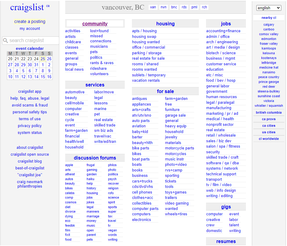
For this project we were tasked to re-design a web page that we felt were difficult to use and or had problems overall. I chose Craigslist due to its cluttered home page.
- Program Used
- Figma
 Click the image for a bigger look!
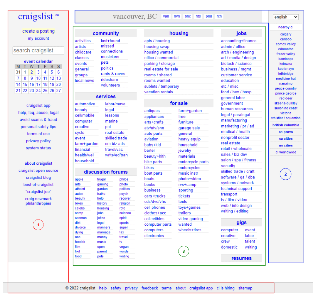
First steps were to determine the issues with the UI and why it warranted a change. For my changes I focused on three specific areas, the left sidebar/footer, header/right sidebar, and the center content.
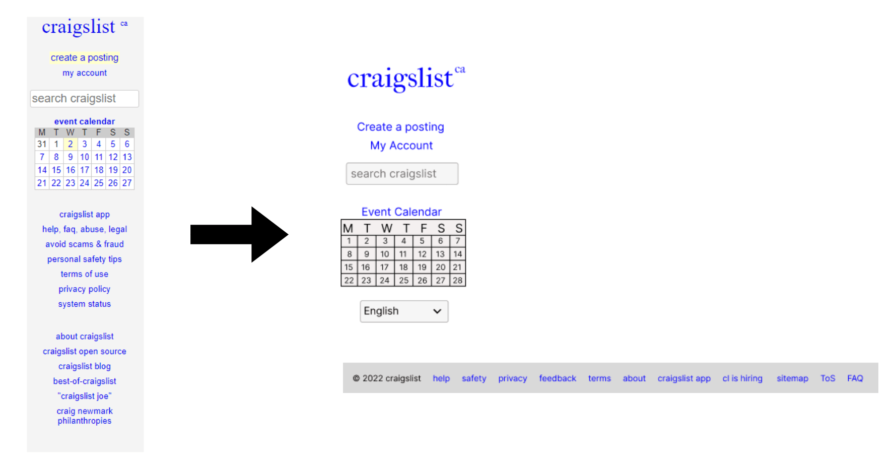
The first place I noticed was the footer and left sidebar. I found that the information contained in the left side of the screen was the exact same as some of the information located on the footer. Some of the links that they have there could also be condensed into the footer for the user so they wouldn’t need to go to different pages. My changes to this were to remove those links completely and combine them into the footer. This frees up the left side of the screen which would allow them to add a new feature or anything else they would like.
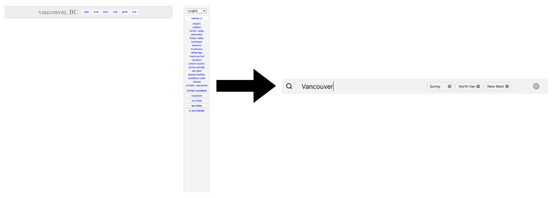
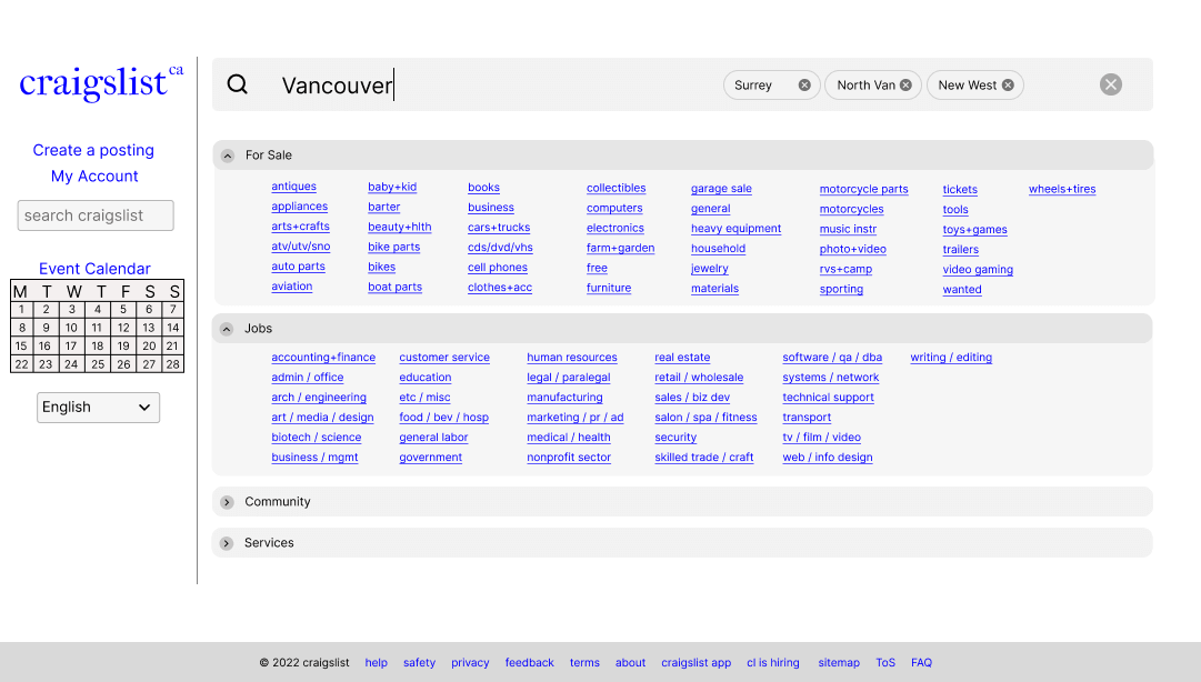
The second modification was for the header and right sidebar. This feature allows the user to pull up a map and filters the different posts by location. While this is overall a great feature, a new user could get confused due to them abbreviating all the location names. This feature also doesn’t allow for filtering and only allows you to pick one location at a time. My changes to this were to have a search bar that takes in different locations rather than have a set parameter based on your location. This also meant that the right sidebar was removed and freed up space on the web page for more features.
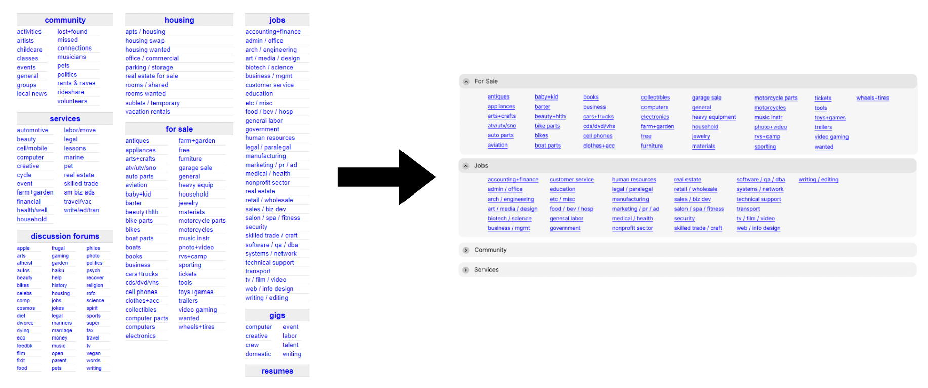
The final changes to the page were in the center, where the main content is housed. While the main section is completely usable, it’s also cluttered due to the amount of selection they have which would cause the user to feel overwhelmed at first glance. Which leads to the improvement of having each category under dropdowns to clear up some space and allow a clear grouping of the different subjects. Due to the changes, the save in space allows them to add more categories later.


